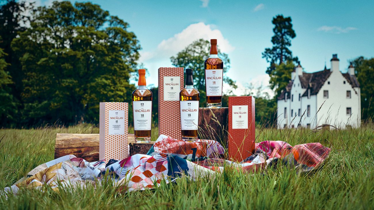
The Macallan Unveils a Bold New Design for 3 Signature Collections
Many of you know are visiting Gentologie because of our whisky chronicles, and today we’re speaking to you not about what’s inside the bottle but on the outside, with The Macallan (one of James Bond favourite) redesign of the Double Cask, Sherry Oak and Colour Collection. I spoke with the Canadian brand ambassador of The Macallan, John Macpherson, about this new direction for The Macallan, a brand that just celebrated its 200 years in 2024.
Normand Boulanger (NB)— Could you please provide a comparative analysis of the new design in relationship to the previous one?
John Macpherson (JM)— We have three collections. There are timeless collections; two are available in Canada domestic retail, which are The Macallan Double Cask and Sherry Oak collections but there is a third collection, the Colour collection, which is available in travel retail duty-free. Essentially, all three of them have been reimagined to really celebrate the journey of our sherry season oak casks and what’s so important to this is our identity and design have evolved, which are still going to showcase our heritage dating back to 1820 when we were founded by Alexander Reid, but our whisky ultimately remains the same.
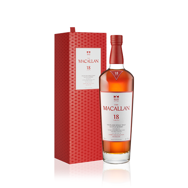
And that’s so key for us to communicate is the whisky is the same whisky. It’s just a new look, a new identity and design to really celebrate 201 years moving forward. And so some of the key things to talk about in the differences are: number one, the same overall shape has been retained. You’ve got that feel of The Macallan but a few different things have happened. One, we really wanted to tell the story of The Macallan through this so we’re seeing a bit of a redder influence on this really tying to our Sherry Cask seasoning, but some of the biggest differences overall is we’ve actually got more height, especially in our higher-end bottles; the 18 years, the 25 years, and the 30 years old is a bit more of a broader shoulder just to showcase itself on the shelf, but we’ve also looked to reduce the weight overall where we can. So we’ve actually reduced the overall glass weight. It’s helped with sustainability efforts and helped with shipping efforts. So we wanted to keep that feel of The Macallan intact for sure. We want people to look at it and recognize that it is The Macallan. But some of the other differences are it’s now 100% fully recyclable. There’s no longer any plastic in our packaging. We have a fully redesigned wooden enclosure, which is actually inspired by the bevel of a cask end with a natural cork. And there’s a new tin capsule wrapping around that cork, enhancing quality and opening experience.
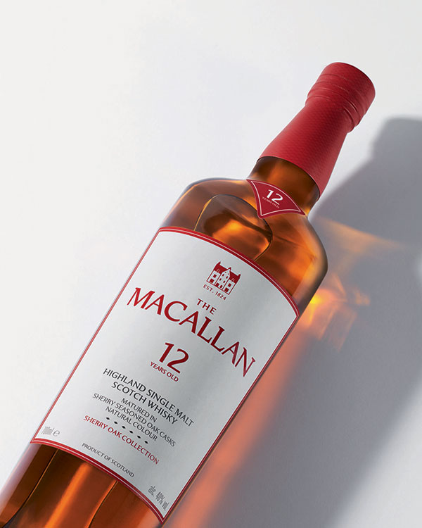
One of the biggest changes is we’ve worked with renowned graphic designer and artist David Carson, and every bottle features a beautiful label, especially the back label actually, showcasing the key tasting notes from the expression. If we’re talking about soft spices, fudge and citrus, you’re actually going to see those as illustrated by David Carson.
NB— That’s a very captivating perspective to help the customer choose a product.
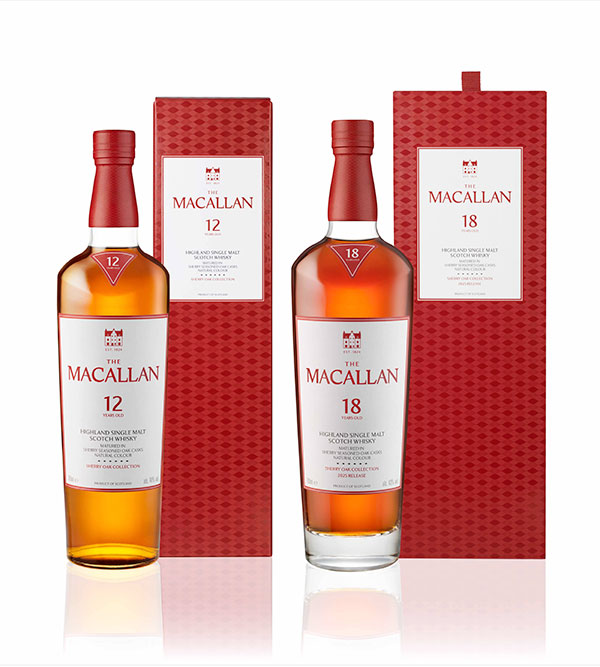
JM— Oh, yes. Well, that’s it. It’s going to be beautiful. So especially on something like the Double Cask collection. Yeah, that’s soft spices, fudge, and citrus. You’re going to see all that on the back label. But on the boxes itself, we actually have a new colour palette realistically showcasing the story of our oak. On the Double Cask collection, you’re going to see a red and white colour palette representing American oak and red representing European oak, as the double cask is that beautiful split of American oak and European oak with a wonderful balance.
“The Macallan has never stood still and never will. This distinctive new identity offers a multitude of visual cues to tell our story, from the sherry seasoning to the American and European oak casks which contribute to the complex taste and flavour profiles in every bottle of The Macallan.”
— Jaume Ferras, Creative Director at The Macallan
Whereas the colour palette on the Sherry Oak collection is actually red; a lighter red with a darker red representing The Macallan founder Alexander Reid, which translates from Scotch Gaelic to Alexander The Red and representing, of course, the European oak. So they are many changes that make us distinctly look like The Macallan still, but also, again, evolving but invoking that heritage story of The Macallan.
NB— That’s very interesting so you were saying about reducing the packaging, and here in Québec, I know the SAQ wants to force the brands to remove the protective cardboard. What is happening with that, if you know what is happening in that case with the new packaging.
JM — This issue is primarily the responsibility of the brand team. I haven’t heard a final decision on it yet.
A packaging with the Quiet Luxury in mind for The Macallan
NB— We are in years that many whisky brands are changing their design, like (i.e., Glenmorangie) and that’s very interesting that they went boldly with their name on the bottle, as The Macallan is more discreet or quiet luxury, in other words.
JM— Yes, The Macallan really enjoyed quiet confidence. We don’t want to put our name everywhere. We want people to very much recognize that it is the The Macallan. But also have that nice subtle look. We want to stand out, but also, know, quietly and confidently who we are. That’s very interesting.
NB— So this changed to reflect the 200 years or it was like meant to be or it’s like just something that you made just for the 200th anniversary or it was like just like a new natural evolution.
JM— Yeah, I mean, it was a natural evolution, for sure. There’s a red thread that really ties the The Macallan together from start to finish. We’re actually into our 201st anniversary now. 2024 was our 200th. So that was about celebrating time, space, and mastery, and the release of the different 200th anniversary releases, whether it was the Harmony vibrant oak, whether it was A Night on Earth and the Jerez de la Frontera. That was all about celebrating 200 years. And so, yeah, with the 201st anniversary starting now. This is all about knowing that we’ve been rooted in two centuries of whisky mastery. Ultimately, we’re just looking to bring our heritage and innovation together. And this was a natural evolution. And actually, one of the great things about this evolution is that it actually evokes the architectural silhouette of The Macallan’s estate in Speyside, Scotland. I don’t know if you’ve seen a photo of the distillery, but the roof of the distillery
is actually rolling green grass hills and in the previous look of the bottle, there was a chevron more like a triangle look cut into the neck but that chevron has actually been replaced by a more subtle wave, which is actually perfectly in line and following the shape of the roof of the distillery.
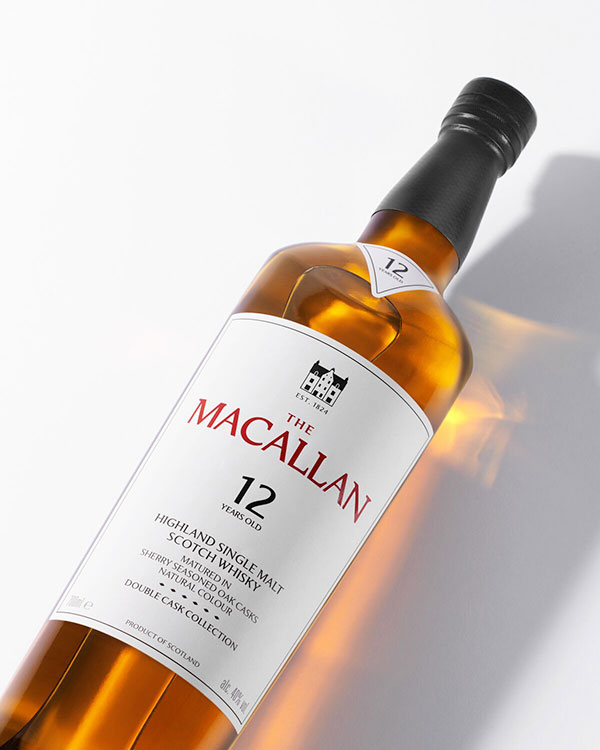
NB— I can see what you mean: I have a 12 years old Double Cask here, but it’s more in the blue tones.
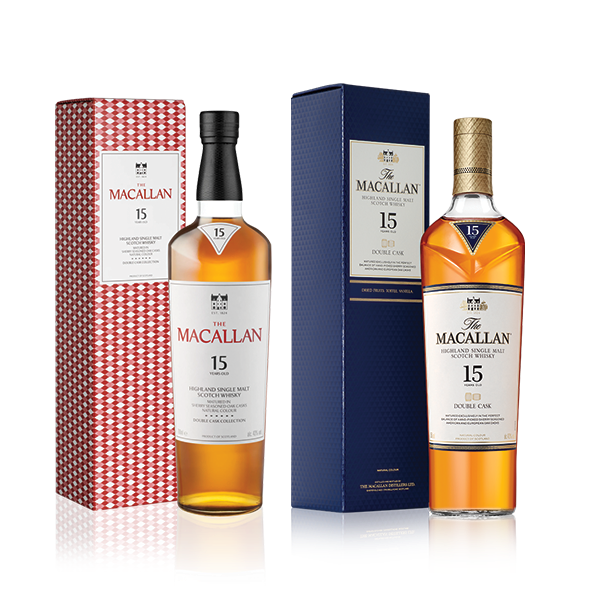
JM— Yes, you have that current look of this collection, with that chevron cut into the glass. The chevron on the new look has more a subtle curve. And actually, that shape is what inspired the new package, the new look and the colour palette.
NB— And just to continue on with what the competition is doing and what you’re doing. I know you don’t want to talk about the other brands, but how did you really different on the shelves when you on a shelf? How do you want to be differentiated when people look at your product?
JM— Yeah, I mean, one of the things about the The Macallan is we’ve kept a fairly distinctly standard shape for as long as I’ve known and that really does stand out so we wanted to keep that. One of the biggest things that we’re actually looking to tell through the new package is the story of our sherry. Ultimately each whisky and expression and the new-look showcase our unwavering commitment to hand-crafting our unique sherry seasoned oak casks.
Whether it’s the selection of our oak wood, the making of the casks, the sherry wine, which is seasoned in a Jerez de la Frontera in the south of Spain or the maturation in our home in Scotland really shapes our unique signature taste, which is ultimately the aroma, flavours, textures and natural colours that create our whiskies, and it’s the story of sherry that we really want to tell through the packaging whether it’s the new oak origins, which I talked about briefly, and are on the front of the new packaging, which helps differentiate the type of oak that’s in there, whether it’s showcasing our natural colour.
“Like whisky, design is all about balance – with The Macallan, I wanted to create a visual identity that respects its rich history and encapsulates its forward-thinking spirit. Each detail, from the label designs to the bottle’s form, is a tribute to the mastery behind every dram.” – David Carson, artist and graphic designer
Ultimately, we want to tell the story of the sherry seasoning, which is something that we actually own that process from acorn to glass ultimately. Whether it’s our saw mills in the US and Spain, to our cooperages in our bodegas in Jerez de la Frontera. These casks ultimately take five years in crafting and so we want that story to be shown. But one of the things that the new look also helps to do is to help consumers navigate through the different collections. And the purpose ultimately is to make it easier for consumers to navigate the portfolio by providing a visual connection between the collections and a clearer articulation of the differences in the whisky. And all this really pulls together to showcase the story of The Macallan to keep it recognizable on the shelves, but also to help provide that visual connection between the collections and showcase who we are and the story of our sherry.
NB— What is the potential impact on consumers on the shelves as we witness a cleaner and brighter image?
JM— This is really brand new, as it is mainly on different media and social media right now. To my knowledge, it isn’t available on Canadian shelves yet. That said, the people that have seen the images of it I’ve spoken with loved it. They loved the way that the Double Cask and the Sherry Oak range really differentiate each other.
The Sherry Oak range really leans into that red colour, which is the reminiscence of Quercus robur, a type of European oak that we utilize in the sherry oak collection, but also the Double Cask collection really differentiates itself. Whether it’s the red and white colour on the pack, whether it’s the black tin wrap around that wooden cork on the top versus the red tin wrap around the sherry oak range. The two really do help differentiate the two apart. So everything I’ve heard from consumers is that they like it. It’s still very much identifiable with the The Macallan, but also a nice fresh evolution of the brand.
NB— Indeed, the new logo makes it also visually enhanced, appearing cleaner and brighter. The revised font makes it more legible. The placement of the brand prominently on the label, even against a white background, is visually appealing. The subtle yet noticeable change in the logo has a significant impact.
JM— Yeah, exactly. It’s still very much identifiably, you know, The Macallan, but a fresh new look.
NB— Additionally, could you please provide an estimated time of arrival for those products in Canada?
JM— So the rollout is going to be happening over the rest of 2025 and probably into 2026. I believe the Double Cask and Sherry Oak 12 years old expressions will be arriving first and it will be arriving starting late summer into the fall, whether it be Québec, Alberta, and Ontario, I believe are some of the first three to be getting it, but it’ll be a phased rollout, as there is still some of the old packaging available in Scotland, but yeah, you should be looking late summer into early fall, you should start to see it arriving on shelves.
NB— It is very interesting. That was very complete and very fascinating. I was wondering if you will know if we will see the changes applied to the other collections?
JM— Yeah, so the only one that has been fully identified so far are the Double Cask Collection, the Sherry Oak Collection and the Colour Collection, and I personally did not see which changes are coming down for the remainder such as the Rare Cask Collection, but I’m certain those are not too far behind.
NB— That’ just the logic that’s logic with the new logo and the brand evolution. Do you have a recommendation for products to try to enjoy the rest of the summer if you can suggest to us one of The Macallan products to try for the rest of the summer while we’re waiting for the new packaging to come.
JM— First and foremost, I love to drink The Macallan neat. The Double Cask Collection has those beautiful citrus and fudge notes as well as the soft spices. For me personally, I do love the Sherry Oak collection; you get those dried fruits, warming ginger and oak spices.
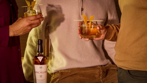
But for those people that are looking to try a cocktail, certainly for the Double Cask collection, I would recommend a cocktail called the The Macallan Meridian (recipe to come).
For the Sherry Oak 12 years old, I recommend The Macallan Robur (recipe to come) .
NB— Perfect. Thank you, John. That was really a great pleasure.
To taste The Macalllan in Montréal, you might want to try the Vargas Restaurant, where The Macallan has a nice display.