RIMOWA: New Brand Image for the Iconic Luggage Brand
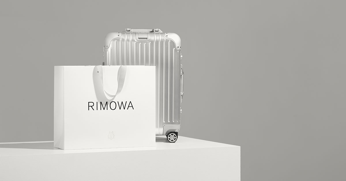
To celebrate the 120th anniversary of the brand in 2018, RIMOWA, which we told you about in our holiday edition, has just revealed, in mid-January, a brand new image. This new identity, which contains a new logo, a monogram, a visual language and new packaging, is the result of a work whose ambition was to create a brand experience worthy of the range recently added to the LVMH portfolio ( Louis Vuitton Moet Hennessy).
RIMOWA: New brand image that links past and present
The origin of the new identity dates back to 1898. The last team, composed of co-CEO Alexandre Arnault and Brand Manager Hector Muelas, is the result of a collaboration between Bureau Borsche, graphic design and branding studio based in Paris. Munich, as well as Commission Studio, a design and branding agency, wanted to make a link on the legacy between the past and the present of RIMOWA in order to put all the emphasis on the history of these last 120 years. The know-how of the company is particularly true for its suitcases, designed and manufactured in a unique process where heritage and crafts coexist with innovation.
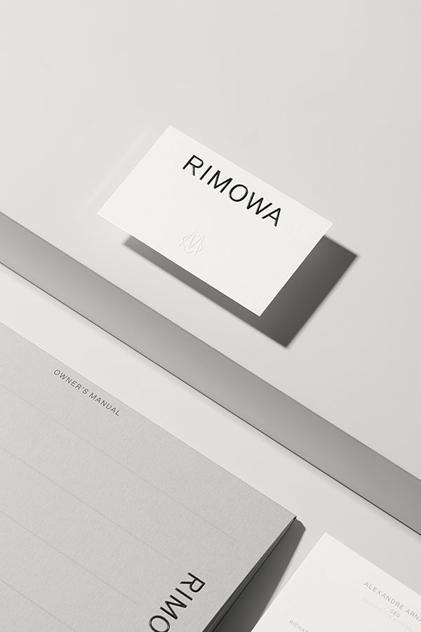
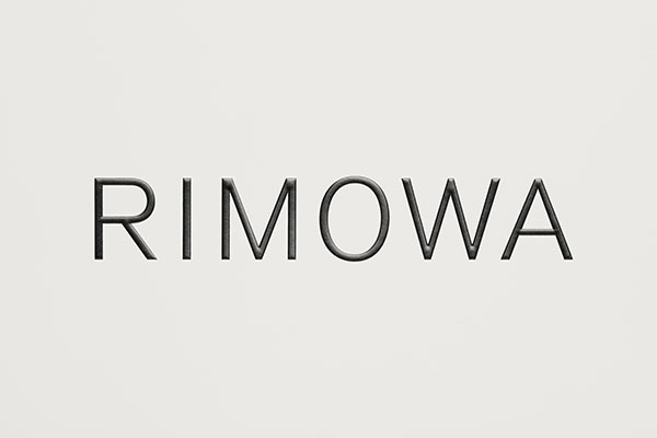
For the new logo, Bureau Borsche chose a sans serif font to inform the brand’s new typographic language. The refined and discreet forms of the police reflect the functional luxury of the suitcases. Its versatility, an indication of future ambitions of RIMOWA. We also note a certain strength with and a presence with this brand new logo, something that the brand can rely on in the coming years.
As part of the identity system, the logo and the monogram
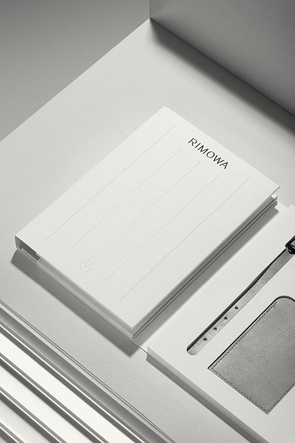
The new logo will be accompanied by a number of visual tools that honour the company’s heritage, while providing a contemporary foundation for its future ambitions: A timeless colour palette of black, white and gray alludes to the long-standing belief date of the mark that less is more, as well as the original aluminum suitcase, which was produced by RIMOWA in 1937. You can also find an article on the 80 years of the aluminum case on our site.
One Letter, A 120 years old legacy.
The M you see a little lower dates back to 1898, when, Koffermanufaktur Paul Morszeck poses in Cologne in Germany, the cornerstone of the success of the brand. This heritage of quality and incredible design that brings all the recognition to the brand today.
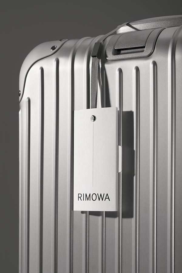
From this M and legacy luggage, a modular system was derived from the grooved pattern characteristic of RIMOWA, a reference to the tactility of the products and materials of the brand.
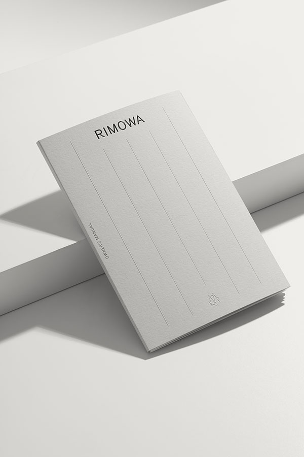
Introduced in 1950 and found on every suitcase built today, variations of the grooved pattern will be subtly engraved in the owner’s manual, affixed to labels and even watermarked on paper holders as pictured on the right.
The new visual identity will result in a redesigned packaging suite and retail touch points. Like the design and engineering of RIMOWA cases, all materials and mechanisms will be considered and cajoled to perfection. Each box and bag, as well as items included in the suitcase such as owner’s manuals and luggage tags, assembled with the utmost care and precision.
You will find it on all products in the range by the end of the year.
Visit the brand website here


