Glenmorangie: With flying colours
The Glenmorangie whisky is evolving. The bottle and visuals change, but the liquid you love remains the same.
Published on · Updated on | 5 minutes of reading
Glenmorangie. It’s been a few years since we’ve talked about this famous brand. I believe that the last time was in our article reviewing the exquisite 1974 Pride edition. Motivated by their desire to innovate and adapt to climate change, the team unveils its new bottle and packaging. I spoke with Ruaraidh MacIntyre, Glenmorangie’s national brand manager for Moët Hennessy in Canada, to find out more about why this rebirth came to be.
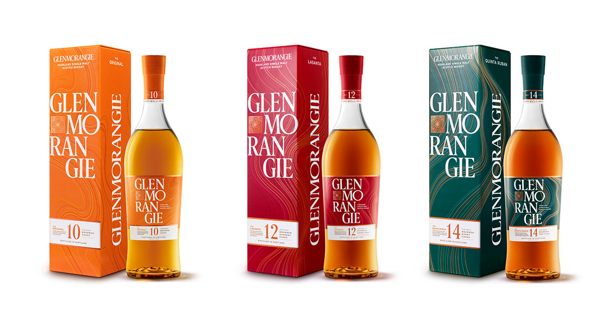
My first guess was that it was simply a way to differentiate the different ages for the products. However, Mr. MacIntyre quickly corrected my guess, pointing out that the distinguishing design of their products has never been about the different ages, but rather about the different blends. The latter candidly admits that it is a marketing tactic. “The brand, with its three new bright-coloured packages – orange for the 10 year old, red for the Lasanta and green for the Quinta Ruban – wants to stand out from the ever-growing competition on the shelves. Our clientele is not the same as 20-30 years ago. Today, we need to be more present in the eye of the new whisky consumer”, says the national brand director.
A tri-coloured experience by Glenmorangie
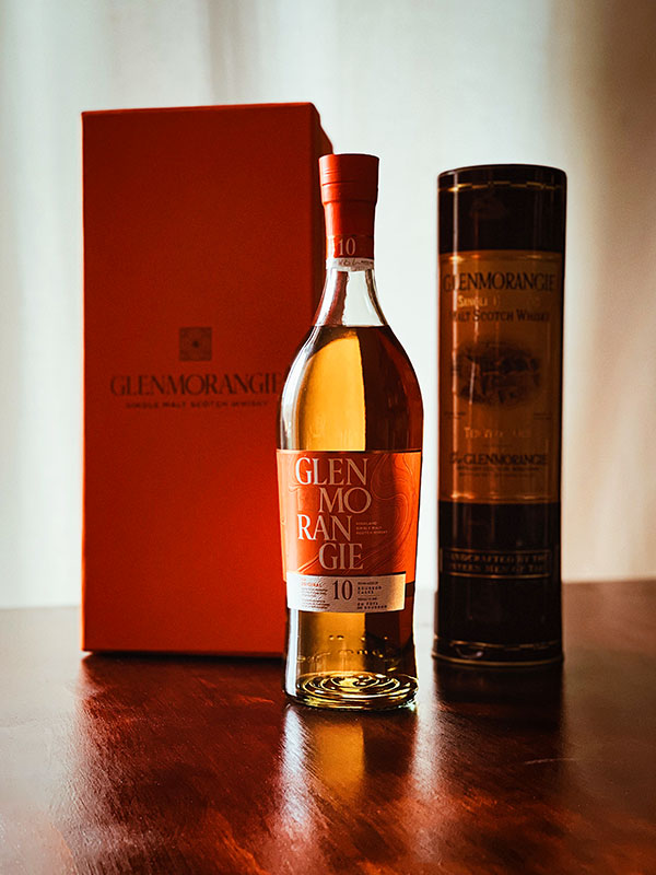
Photo: Normand Boulanger | Gentologie
A new triad of eye-catching colours make up the daring elegance of Glenmorangie’s packaging and bottles. Upon first glance, one can notice a cluster of lines threading through each of them. They aim to symbolize the fluidity of the drink, the veins of the wood composing the barrels in which the whiskies age and the wavy landscape of the Highlands around the distillery. In addition, The Signet logo has been cleaned up and is more prominent, while the Glenmorangie brand name is stretched over four lines through an original vertical design. To sum it up, the new expression of the brand identity highlights the flavours of the whiskies, which I am pleased to present to you here.
The three colours
Orange
The 10 year old is a brand classic, with the presence of orange, vanilla and peach aromas, which explains the fiery hue. The colour also refers to the brand’s symbol, the giraffe, which is related to the fact that the company uses the highest stills in Scotland. Indeed, they are almost the same height as the great African animal, and that extra room allows for more taste and aroma to develop according to the company.
Red
The 12 year old, better known as Lasanta, has a unique taste defined by its finishing in barrels of Spanish Pedro Ximénez or Olorosso sherry. Elegant notes of grape, cinnamon and hazelnut emerge. No other colour than red can embody the noble taste of this fine elixir.
Green
Here is the 14 year old, the Quinta Ruban. We observe here a smooth and voluptuous English green that is inspired by the flavours of peppermint chocolate, nuts and even black pepper. Some connoisseurs can also recognize notes of mandarin and toasted marshmallow. It is almost like biting into our favourite holiday chocolate.
“It’s no longer enough to offer a palate-pleasing whisky, you also have to catch the consumer’s eye. There are now over 100 whiskies on the LCBO and SAQ shelves, so we need to stand out”, says the Glenmorangie brand director in Canada.
A bold bottle design for Glenmorangie
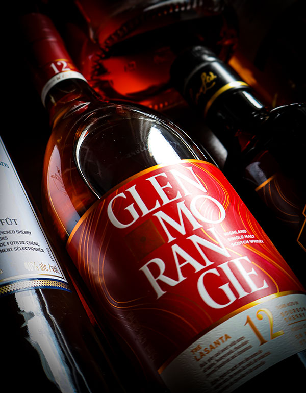
Photo: Normand Boulanger | Gentologie
In addition to bearing the new colours, the precious liquid is housed in an all-new bottle that features larger shoulders, a tapered neck and cap, and a swirl at the bottom inspired by the Glenmorangie logo. As mentioned earlier, this emblem, called The Signet, on the front side of the new packaging. As the brand develops more high-end products over the next few years, the packaging may also continue to evolve.
Sustainable development, a priority for the Louis Vuitton Moët Hennessy group
The LVMH conglomerate (Louis Vuitton Moët Hennessy), owner the Moët Hennessy division which Glenmorangie is a part of, has made sustainable development a priority in all its Houses. As a result, the famous brand’s packaging is entirely recyclable, and the team hopes to completely eliminate cardboard from its packaging in the coming years to reduce its carbon footprint.
Additionally, two ambitious initiatives to purify all wastewater from the whisky distillation process have taken flight. The first project is the creation of an anaerobic digestion plant to clean the by-products of the distillery located on the Scottish coast (95%). The second, called DEEP (Dornoch Environmental Enhancement Project), aims to reintroduce native oysters into the Dornoch Firth estuary that have been decimated for over a century in this part of Scotland. Repopulating this species should purify the remaining 5% of organic waste in the water.
Theses are mere examples of what is being done at Glenmorangie to support an environment-based approach.
The new bottles of Glenmorangie (all presented on the brand website) are now on sale at your favourite spirits retailer.
Enjoy your tasting.
Article originally published in Gentologie magazine Issue 11. Subscribe to the Club by Gentologie to receive our future magazines.
Note: When we learn that an error has slipped into our site, we report it by correcting it. If you notice an error, please inform us by contacting us through our Contact us page.